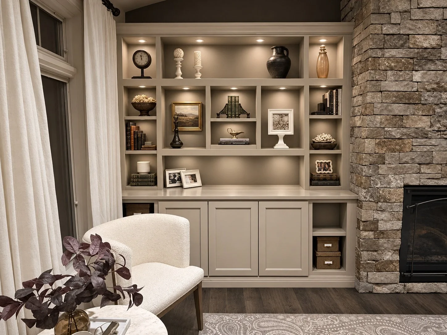
In the world of new builds, we often see the fireplace in the great room designed with a pair of built-in shelves or bookcases flanking it. When they’re first installed, they’re gorgeous.
Then moving day comes, and nobody quite knows what to do with them.
A built-in that size is a lot of space to fill. It takes a surprising number of pieces to make it look finished. I often notice that over time, the shelves slowly turn into open storage. Items that no one knows what else to do with get added here and there, the shelves start looking cluttered. Before long, the whole piece has lost the styled look the homeowner originally desired.
The built-ins you see in beautiful photographs look effortless. But there’s usually a professional stylist behind them, and getting that same look in your own home can be harder than you think.
There are a few guidelines I follow when I’m styling a built-in, especially a really large one. And once you understand them, the whole process gets a lot easier.
Start with a Color Theme
Before I put anything on a shelf, I decide on a color theme.
The easiest place to start is with neutrals. Ivory, cream, beige, white. Pick a color family and let that become the foundation for most of your pieces.
If your home has a little more color, that’s fine too. You can build your entire theme around a color you love. The important thing is that at least 60 percent of what you’re using falls within that color family.
And don’t use the exact same shade of everything. You want lots of variation within that color. Different shades of ivory, different shades of cream, warmer and cooler tones. If everything is exactly the same color, it starts to look flat.
And flat is what we’re trying to avoid.
Books Are the Foundation
Especially in a built-in bookcase, I think shelves filled with nothing but decorative objects look a little strange.
Books are the foundation. They don’t necessarily have to take up the most space, but they give everything else something to build around.
I choose books that work within my main color family or one of my supporting colors. I almost always take the dust jackets off because the actual covers tend to be much prettier.
But here’s something else I think matters. Use books you actually like.
Most of the books in my own built-ins are books I read, reference, or pull down from time to time. I don’t particularly love the idea of buying a bunch of books just because they’re the right color.
Your home should still feel like your home. The things on your shelves ought to mean something to you.
Add Two or Three Supporting Colors
Once you’ve established your main color family, you can start bringing in a few other colors.
Remember, about 60 percent of your pieces should fall within your main color family. The remaining 40 percent can be made up of two or three supporting colors.
For me, one of those colors is almost always black.
I use black in nearly everything I design. In a built-in I use black as a punctuation mark or a breaking point when objects start to meld together too much, but I don’t want it everywhere. Just little pops of it here and there.
So I might have a built-in that’s mostly ivory, cream, and beige, with touches of black and some warm brown woven throughout.
The trick is to distribute those colors across the entire built-in instead of concentrating them in one area.
You want your eye to travel.
Repeat Your Shapes
This is one of the most important parts of styling a large built-in, and it’s something I think people often overlook.
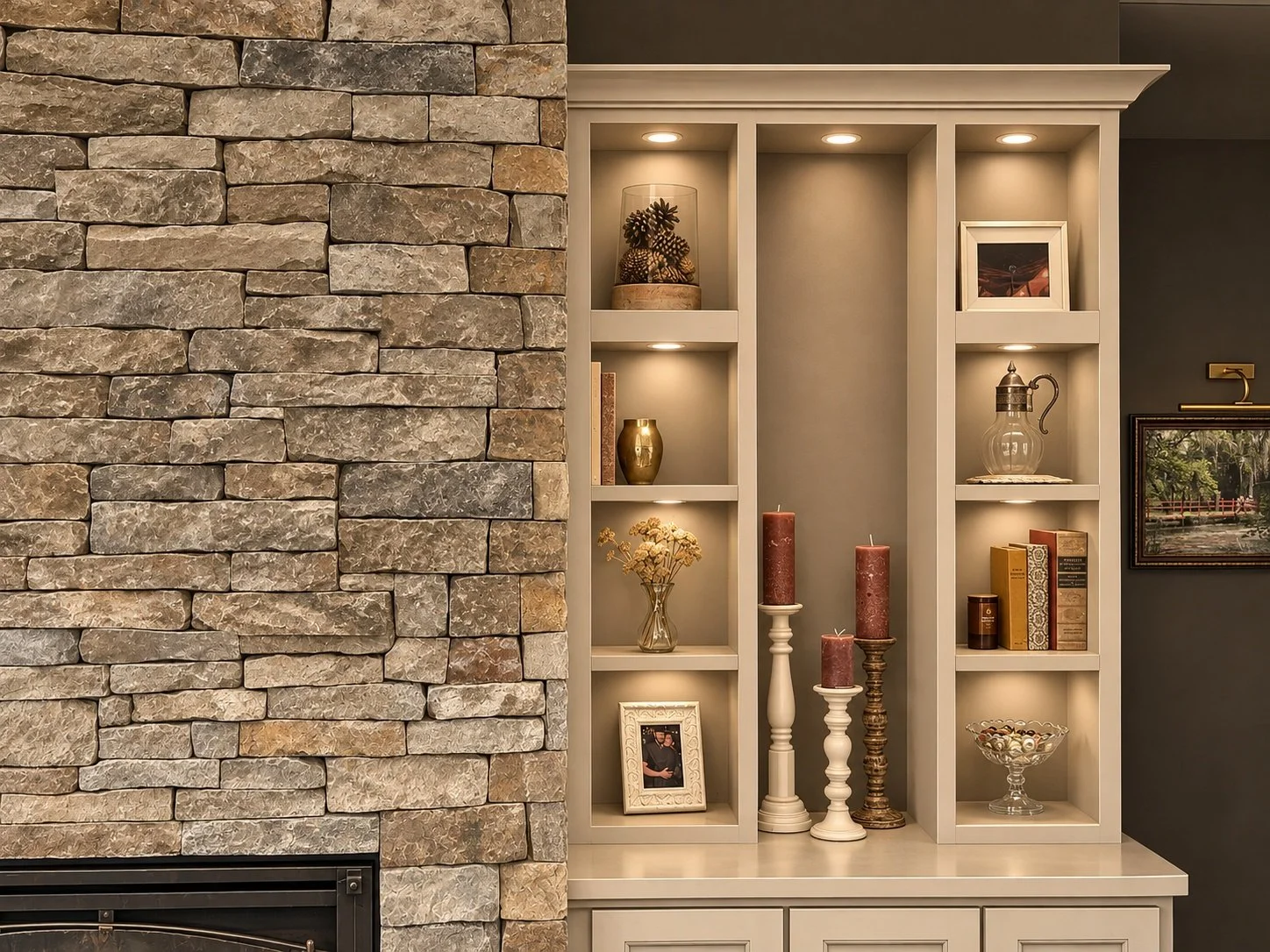
I repeat shapes throughout the shelves, but I spread them out.
If I have a round vase on one side, I might put a round bowl a couple of shelves down, and then another piece of rounded pottery somewhere on the opposite side.
They aren’t the same objects. They just have something in common.
Our brains are constantly looking for patterns, whether we realize it or not. When we see similar shapes repeated throughout a space, our eyes naturally move between them. We start making connections, and the whole arrangement feels more cohesive.
Color works the same way. Your eye picks up a little black on one shelf, finds it again somewhere else, and then again on the opposite side.
It’s subtle, but it makes an enormous difference.
And this is how you can have a lot of things in a built-in without it looking cluttered.
The key is repetition with variation.
I don’t want the exact same vase repeated five times. That looks stiff and manufactured. I want similar shapes, similar colors, and pieces that relate to one another without being identical.
Vary the Heights
Another thing I pay close attention to is height.
I don’t want everything on a shelf sitting at the same level. I’ll use taller pieces alongside shorter pieces, stack a few books horizontally, stand others vertically, and let objects sit at different heights across the shelf.
When everything lines up at the same height, the display starts looking flat again.
It feels a little plastic. A little too perfect.
I want the shelves to have some movement to them.
Vary the Textures
Texture is just as important as color and shape.
I don’t want everything smooth. I don’t want everything fluted. And I certainly don’t want every single piece to have the same finish.
I like mixing pottery, glass, wood, books, natural materials, and things with a little texture to them.
And just like shapes, I look for ways to repeat those textures throughout the built-in.
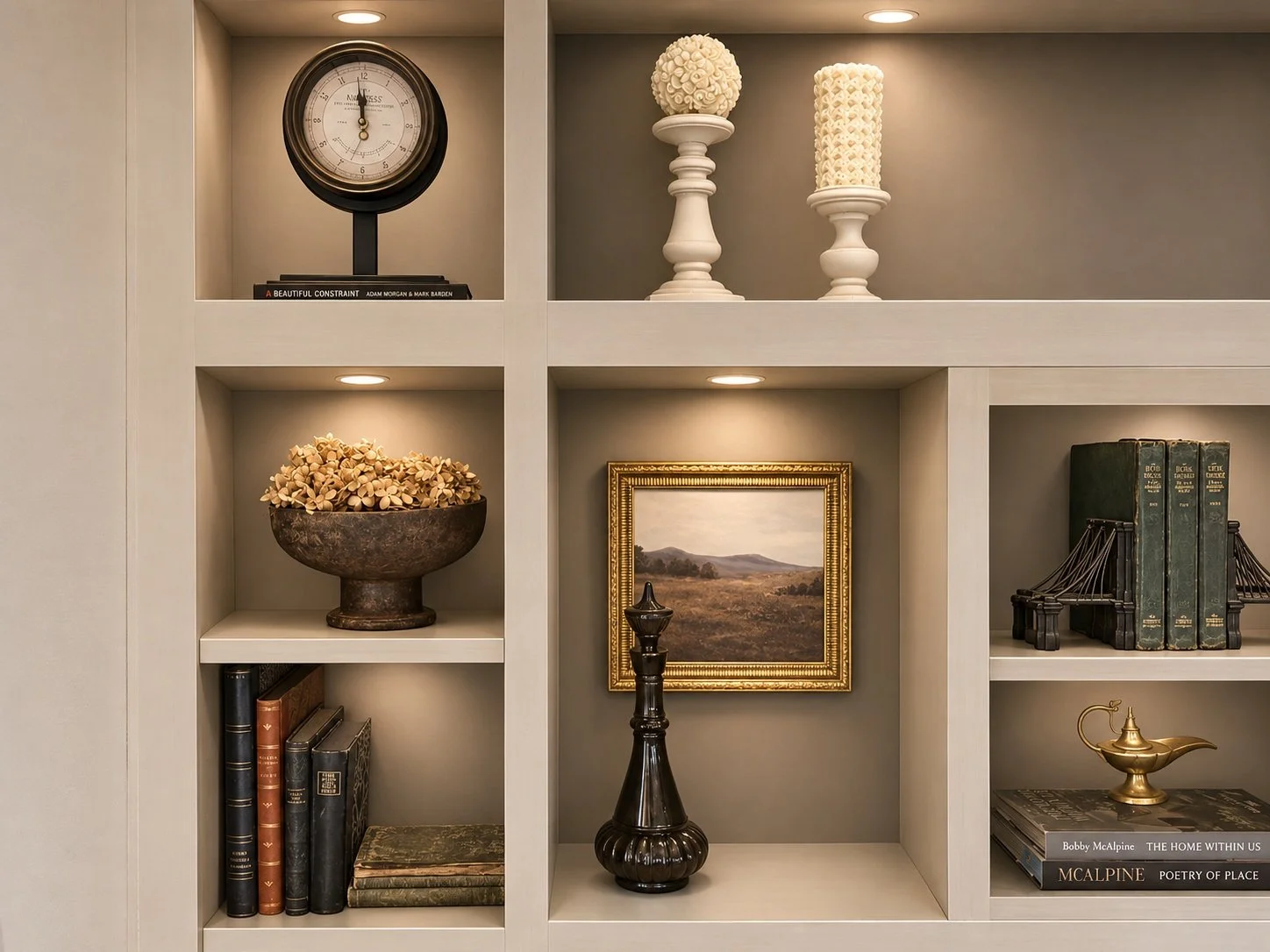
Maybe there’s a bowl of dried hydrangeas on one shelf. A couple of shelves away, I might use something with a similar lacy, delicate texture, but in a completely different kind of object.
They don’t match, but they relate.
That’s really what I’m trying to accomplish with all of this. I want the pieces to have something in common without looking like they came out of the same box.
Add a Little Shine
I almost always add a few things that have a little shine or sparkle.
It might be brass, crystal, a small mirror, or a lamp that comes on in the evening. Sometimes it’s as simple as a candle.
Although my husband has officially banned lit candles in our built-ins. We may have some close calls a time or two...
But a little shine goes a long way.
I don’t want it everywhere. Too much starts looking tacky pretty quickly. I just want a few pieces that catch the light and bring a little brightness to the shelves.
It’s one of those things you may not consciously notice, but you feel the difference when it’s there.
The Goal Is a Collected Look
I think the word I keep coming back to throughout all of this is flat.
A flat display just doesn’t have much life to it. Everything is the same color, the same height, the same texture, or looks like it was purchased from the same showroom on the same afternoon.
And to me, that’s what makes a space feel soulless.
I don’t want a home to look like someone walked into a store, bought everything on display, and recreated it in their living room.
I want it to feel collected. I want the things in it to have some meaning. I want there to be enough variation to make it interesting, but enough connection between the pieces that the whole thing feels intentional.
That’s really what all these little guidelines are about.
Not creating a perfectly styled bookcase, but creating one that feels like it belongs in your home.
Because at the end of the day, that’s what I’m always trying to bring into a space.
A little soul.
Leah & Maya | Ever After Interiors · Casper, Wyoming